


On 13 March 2015 an art-for-architecture proposal was submitted for the Amtsgericht (district court) in Günzburg. It is a work of forms and colours, entitled “Justitia progrediens”, extending over the exterior and three storeys of the interior. Its basic motif is the scales of Justitia (Justice), which are modified in several ways.

upright rectangle
and variations
on it
15-06-001

of the rectangle
to the scales
15-06-002
of the scales
15-06-003
of the work for the
outer façade
15-06-004

outer façade
15-06-005
outer façade
15-06-006

of the work for the
ground floor
15-06-007
ground floor
15-06-008
ground floor
15-06-009
of the work for the
second floor
15-06-010
second floor
15-06-011
second floor
15-06-012

of the work for the
third floor
15-06-013

third floor
15-06-014
third floor
15-06-015
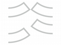
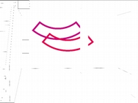
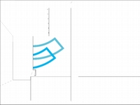
The idea behind this artistic concept is the aesthetic implementation of the principle of justice. Justitia progrediens – Justice progressing, moving ahead – accompanies visitors entering the building and through the building. It is anchored in the building by means of its close relationship to the architecture. The determining characteristic of the architecture is the elongated upright rectangle, perceived from outside as a grid on the façade, from inside as a window opening. This vertical rectangle is the basic element of the Justitia progrediens concept. It stands for the clarity, reliability and immovability of legal norms. In a curved variation, the rectangle becomes the scales of justice and thus a further element in a consistent formal vocabulary.
The scales are set sometimes higher, sometimes lower, thus conveying movement, life and above all the principle of the legal process: weighing up and considering. Justice thus appears not as an allegory, i.e. a person, but as an action, an effect, and therefore is manifest in its specific meaning.
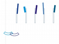
A third element of the formal vocabulary is seen not as a contour but as a filled-in surface, thus gaining particular weight: a rectangle in varying proportions and set at varying angles, representing the tilting of the scales – an indication of the act of weighing. In different variations, this element represents the diversity of judgments and the individuality of each separate case. It testifies to the liveliness of the judicial process against the backdrop of clear, binding laws.
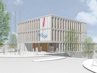
These elements constitute the complete, seemingly moving scales of justice, which greet visitors on the façade and accompany them through the building with partial quotes that are repeatedly renewed – with a different colour mood on every floor.
The individual elements of the images are made from three-millimetre-thick aluminium using laser technology. The paint is applied wet (gloss). A coating of clear lacquer with UV protection is added to the elements placed outside. They are screwed to the walls with a gap of 20 mm in order to create a three-dimensional effect by casting shadows. The corners and edges are slightly rounded to exclude any danger of injury.
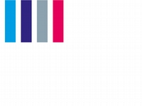
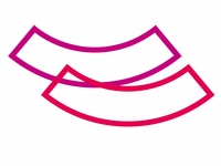
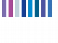
The basic motif on the façade comes to life through its shades of blue and red. Blue is the colour of Bavaria. Red is a classic signal, representing life on the one hand and the books of law on the other hand. This colour scale determines the whole artistic concept. The motif on the ground floor concentrates on the red area of the colour spectrum, thus enhancing its effect as a signal in the wide spaces of the hall.
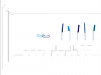
The motif on the second floor explores the blue part of the colour spectrum by making a tendency to blue-green perceptible. In this way an effective contrast to the wood colours on the walls is achieved.
This colour concept is marked by consistency throughout, but at the same time it lends an individual colour mood to the different floors. On this basis, the contribution of the art to a system of orientation, with colours identifying the different floors, could be extended. The ensemble on the first floor concentrates of the blue part of the colour scale, thus generating a calming influence in the zone where people wait.


