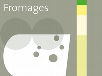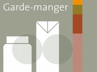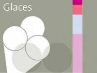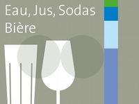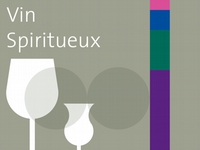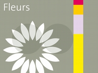


For a chain of stores in France that specialises in regional foods, an art concept was produced to strengthen links: between producers, suppliers and buyers, between a brand and its area, between a chain of stores and its perception. The content of the art concept is the transcendence of shopping (shopping is life). The aim of the art concept is the aestheticisation of shopping (shopping is beautiful). The double circle as the fundamental element of the corporate design is a formal basis for all concept proposals.
The principle of the colour code forms the basis of the concept. Each colour code stands for a product segment. The colour composition refers where possible to the natural colours of the goods that it identifies, and enhances the associations and familiarity of the purchaser. The colour code accompanies the presentation of the goods and the communication of the offer.
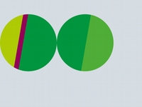
for fruit
and vegetables
14-13-001

for frozen foods
14-13-002

for dairy products
14-13-003
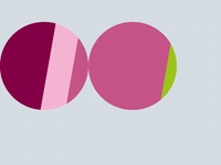
for patisserie goods
14-13-004
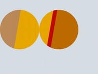
for baked goods,
spreads
14-13-005
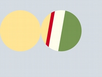
for pastries, spices
14-13-006

for cheese
14-13-007
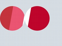
for meat and sausage
14-13-008
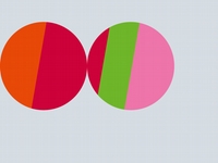
for charcuterie,
pâté, snacks
14-13-009

for eggs,
butter, flour
14-13-010
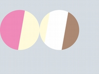
for ice cream
14-13-011
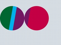
for drinks
14-13-012
The pictogram is a further element of the concept. A pictogram can represent a segment of the assortment and thus covers the same meaning as the relevant colour code. The pictogram can also differentiate within a goods segment, however. There can thus be various pictograms within a goods segment. The unifying factor here is always the colour code. The design of the pictograms corresponds to the double circle of the corporate design.
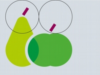
for fruit
and vegetables
14-13-013
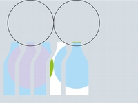
for dairy products
14-13-014
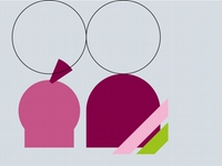
for patisserie goods
14-13-015

for baked goods
14-13-016
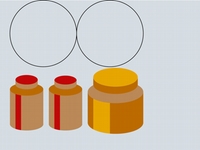
for spreads
14-13-017
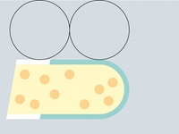
for cheese
14-13-018
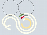
for pastries
14-13-019

for spices
14-13-020
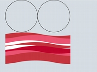
for meat and sausage
14-13-021
In a further step in the development, the pictogram is dominant. The double circle is integrated in such a way that its presence is only latent, like a watermark. The 12 product segments, now newly categorised, are each identified by a pictogram and by a colour code.
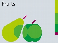
for fruit
and vegetables
14-13-022
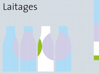
for dairy products
14-13-023
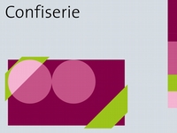
for patisserie goods
14-13-024
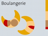
for baked goods
14-13-025
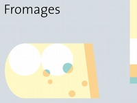
for cheese
14-13-026
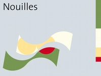
for pastries
14-13-027
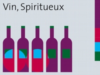
for wine, spirits
14-13-028
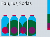
for soft drinks
14-13-029
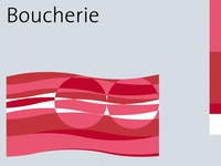
for meat and sausage
14-13-030
On this basis a line of design is developed that separates the pictogram and the colour. The colour is now only a colour code and no longer has an illustrative function. The visualisations of the product segments form a homogeneous element throughout the assortment. In the pictograms, the unified formal vocabulary is prevalent in relation to the individualising graphic form. The principal distinguishing feature is the colour code.
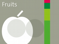
for fruit
14-13-031
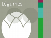
for vegetables
14-13-032
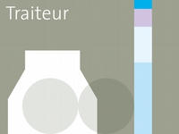
for dairy products
14-13-033
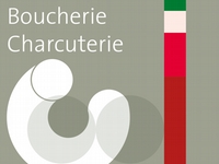
for meat and sausage
14-13-034
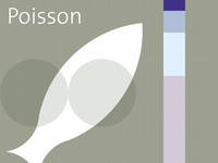
for fish
14-13-035
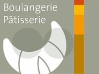
for baked goods
14-13-036


