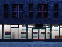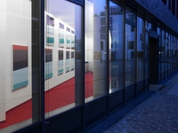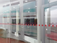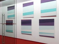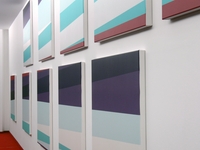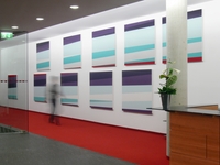


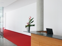
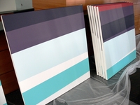
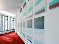
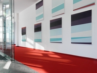
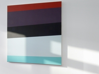
On 14 February 2009, ten digitally printed canvases, 125 x 125 cm (49" x 49"), were installed in the foyer of the law firm Luther in Cologne. The canvases constitute a concept that was developed specifically for this location and its architecture.
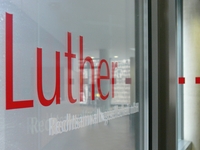
of the law firm
Luther, Cologne
09-01-001
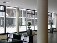
of the law firm
Luther, Cologne
09-01-002
of the law firm
Luther, Cologne
09-01-003
The concept’s aim is to accentuate the identity of a location. The location is a foyer, an interface between interior and exterior. The interior is an office complex, the central location of a company’s identity with following characteristics: legal counseling according to efficient “corporate” criteria, orientation to the situation and intention of the clients, courage in the innovation of distance (view the familiar as foreign) and the integration of these aspects in one coherent approach (a central theme). The interior is also a place where individuals cross paths, and where an individual web of relationships is woven and unraveled. In short: the individuality of a building.
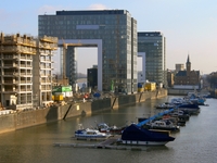
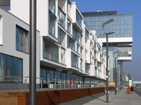
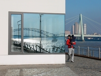
The exterior, the “Rheinauhafen” in Cologne, is an area undergoing a functional metamorphosis: from the harbor as a hub of trade to the “bureautope” as a hub of ideas. The exterior is furthermore a fertile ground for creative architecture and creative urbanism. The interface between the interior and exterior is as such an interface between creativity on the inside and creativity on the outside.
environment of
the “Rheinauhafen”
in Cologne
09-01-004
environment of
the “Rheinauhafen”
in Cologne
09-01-005
environment of
the “Rheinauhafen”
in Cologne
09-01-006
A further aim of the concept is to strengthen the empathy with a location. The employees of the company identify themselves with the location, where they spend a part of their lives; where they invest their expertise, dedication and energy; and where they find self-fulfillment, confirmation and financial reward. The company’s visitors identify themselves with the location, where insights and expert knowledge are attained; where guidance and support are experienced; and where communication, participation and proximity are felt. The viewers outside identify themselves with the location, where the first encounter triggers an impulse perception creating an awareness of a split second of one’s life, which becomes a familiar topos upon repeated encounters.
The environment creates foundations for perception: Color impressions outside are seen and retained upon entry into the foyer. The color impressions, which appear upon entry inside, accompany the perception of the canvases. The sequence of squares, originally a functional measure for the safety of the visitor, becomes furthermore an effective factor in perception. The entire surroundings are filled with polyrhythmic structures of verticals and horizontals. All these foundations belong to the identity of this location. The art concept accentuates this identity, referring hence to these foundations.
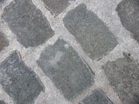
colour impressions
09-01-007
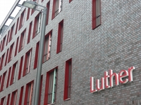
colour impressions
09-01-008
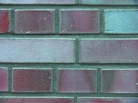
colour impressions
09-01-009
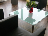
colour impressions
09-01-010
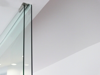
colour impressions
09-01-011
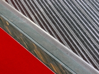
colour impressions
09-01-012
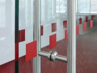
a perception factor
09-01-013
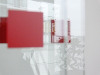
a perception factor
09-01-014
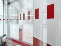
a perception factor
09-01-015
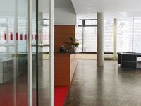
structure
of horizontals
and verticals
09-01-016
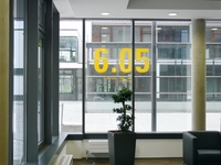
structure
of horizontals
and verticals
09-01-017
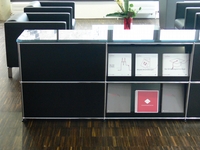
structure
of horizontals
and verticals
09-01-018
The art concept alludes to the architectural concept. The foyer is the interface between inside and outside. Hence the foyer is simultaneously interior and exterior. This ambivalence appears in the floor plan as an isolated “segment”: A corner of the building’s structure is quasi cropped. The shape of this cut is a right-angled triangle. From the triangle in the floor plan, a prism is formed in the structure. Both legs of the prism form transparent walls. The foyer orients itself towards the exterior through these walls. Hence the ambivalence between the interior and exterior is confirmed. The hypotenuse of the prism produces a non-transparent wall. This is the joint between the inner structure and the foyer, which is directed towards the exterior. The entrance to the inner building opens itself only when one circles this wall. Hence the separation of this “segment” is confirmed.
The foyer serves a communicative function. A wall side and a window side define it. The wall side communicates through the window sides. This communication yields content to the art concept. The wall emanates a dual effect: Pedestrians and visitors have the wall before them. They experience the wall as a screen. They look at the wall. The employees have the wall at their backs. They experience the wall as a background, a base and a support. They know the wall.
The wall delivers the foundations for the formal approach. As an interface, the wall has a communicative relevance. Hence the art concept enhances the wall’s existence. The breadth of the wall is accentuated and exploited. Even the direction of the wall is emphasized. It points from left to right. The visitor moves to the front desk from left to right. The right-angled triangle opens from left to right. Finally, the art concept strengthens the unity of the wall. Because two factors interfere with the perception of the wall: the lack of viewing space within the foyer and the glass windscreen in the entrance.
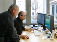
of picture files
09-01-019
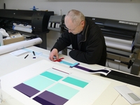
approval
09-01-020
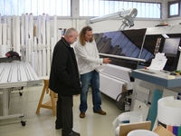
approval
09-01-021
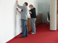
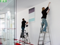
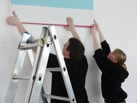
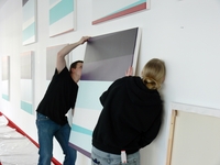
The art concept was implemented in ten 125 x 125 cm (49" x 49") pictures, digitally printed on canvas. The layout, editing and pre-press production of the image files were executed by Thomas Maxeiner Visual Communication (www.creativerepublic.net). Print and installation on site were carried out by Motion Design, Frankfurt am Main.
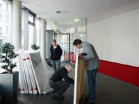
of the canvases
09-01-022
of the canvases
09-01-023
of the canvases
09-01-024
of the canvases
09-01-025
of the canvases
09-01-026
of the canvases
09-01-027
of the canvases
09-01-028
of the canvases
09-01-029
of the canvases
09-01-030
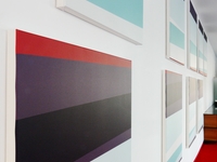
of the canvases
09-01-031
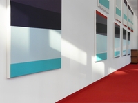
of the canvases
09-01-032
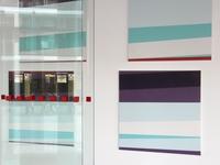
of the canvases
09-01-033


